Mapping maternity care scores across England using geopandas
On the 21st of September the BBC published an article with analysis of the latest Care Quality Commission (CQC) results regarding maternity care. You can find it here.
The article states that more than half of maternity units in England fail consistently to meet safety standards and makes for quite uneasy reading.
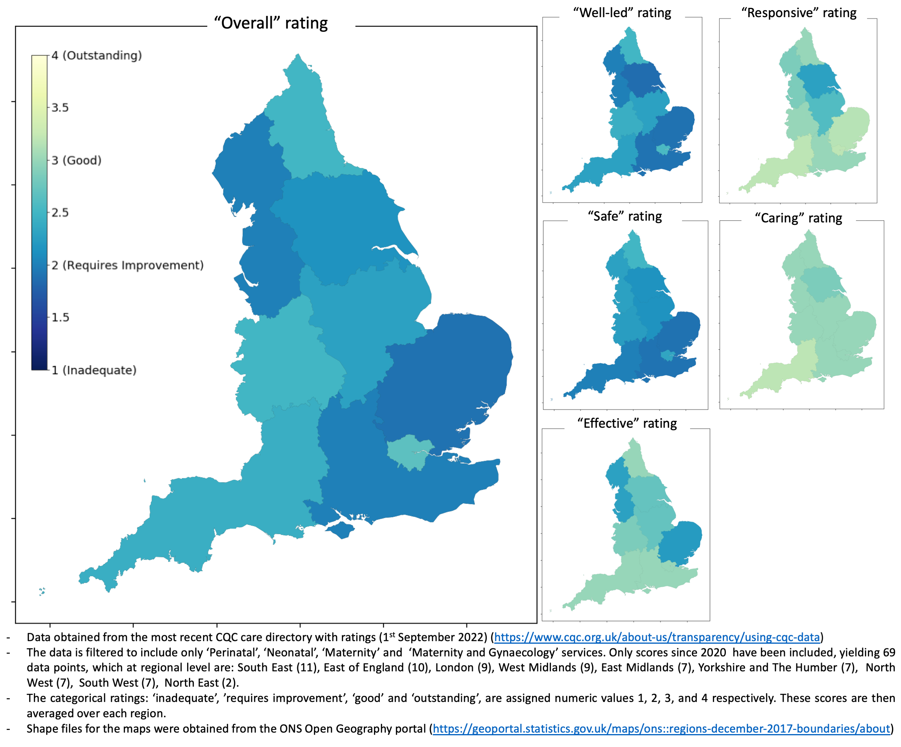
The CQC data can be easily downloaded from their website and I was curious as to the regional distribution of the most recent scores (since 2020). So, I created the following figure using the geopandas package. Note that restricting the data to assessments since 2020 results in an average of 8 scores per region to produce the aggregated score, but caution should be taken with the North East metric for which there were just 2 data points available. Futher information on how the data was processed prior to plotting are included in the figure.

I don’t want to delve too deep into the meaning of these results. I’m not an expert in this field and I imagine that what the CQC does in quantifying exactly what is ‘good care’ is an extremely complex task.
The general blue’ish hue across the ‘Overall’ rating metrics reflects that the average “Overall” rating for England based on the scores since 2020 is between “Requires Improvement” and “Good”. This is broadly what was found in the BBC article. However, the ‘Caring’ and “Responsive’ ratings are consistently higher, scoring far more ‘good’ ratings, something that wasn’t highlighted in the article. The ‘Overall’ rating seems to closely correlate with the ‘Safe’ and ‘Well-led’ metrics. Overall there doesn’t seem to be an obvious North-South divide or other disparity, at least at a regional level, however, the ‘Safe’ rating would seem marginally lower in the southern regions for this most recent data.
An overview of plotting in geopandas
Geopandas is a brilliant open source package for geospatial analysis, especially if you are, like me, familiar with pandas, but not so familiar with mapping. All you need is the shape files for the map you want to produce the plot for and summary statistics for the polygon areas of the map covered by your shape file. The shape files used to make these maps were obtained from the ONS Open Geography Portal.
I’m not going to give a full tutorial on how these figures were generated this time, since most of what I learnt I pulled from the following introduction from the geopandas docs here.
The core process is summarised below though:
import geopandas as gpd

# Read in the shape file for your map as a geopandas dataframe:
shp_file = 'england_regions_shape_file.shp'
england_regions = gpd.read_file(shp_file)

# Create an additional column in this geopandas dataframe with the regional scores:
england_regions['score'] = england_regions['regions'].map(mean_scores)

# Plot the shape file polygons and color using the 'score' column:
england_regions.plot(column='score')
Reading in the shape file creates a GeoDataFrame object, here called england_regions. Columns can be added in the same way as a regular pandas DataFrame and in the above example the average score per region is mapped onto the GeoDataFrame. Once the scores are mapped to their respective regions, plotting is done by simply calling the .plot method and passing the column by which the regions should be colour coded
